Julie Arciaga
School Design Project

This project was inspired by Severn Suzuki's powerful speech about the environment and all the harm the human race is having on it. The color pallet was chosen because of the idea of strength it conveys. The typeface used is Optima because of how it resembles a human figure with its hourglass shape.

This project was inspired by “#Selfie” an article about this generation being obsessed with taking pictures of themselves. The story talked about Kelly Slaters’ forms of taking pictures of himself while surfing, which is why the spread mainly features photography of him.

The inspiration for this mark came from the idea of the helping hands that it takes to run this beautiful zoo.

The inspiration behind this hypothetical resort is a tree house hotel where guests can explore the exotic wilderness with friends and family.

This project was inspired by one of the 7 items of the half sin table traditionally used during the new year celebration. The fish, which represents life in the new year, is seen swimming over Persian patterns. This contrast introduces the viewer to not only the Nowruz celebration but also Persian art and culture.


This project was inspired by Rethink LA, a recycling program in Los Angeles. Blue was used as an accent color to the green that people see in recycling programs. The brochure is printed on a crinkled paper texture to show that even recycling paper is important and the typeface Optima was used for the entire design.


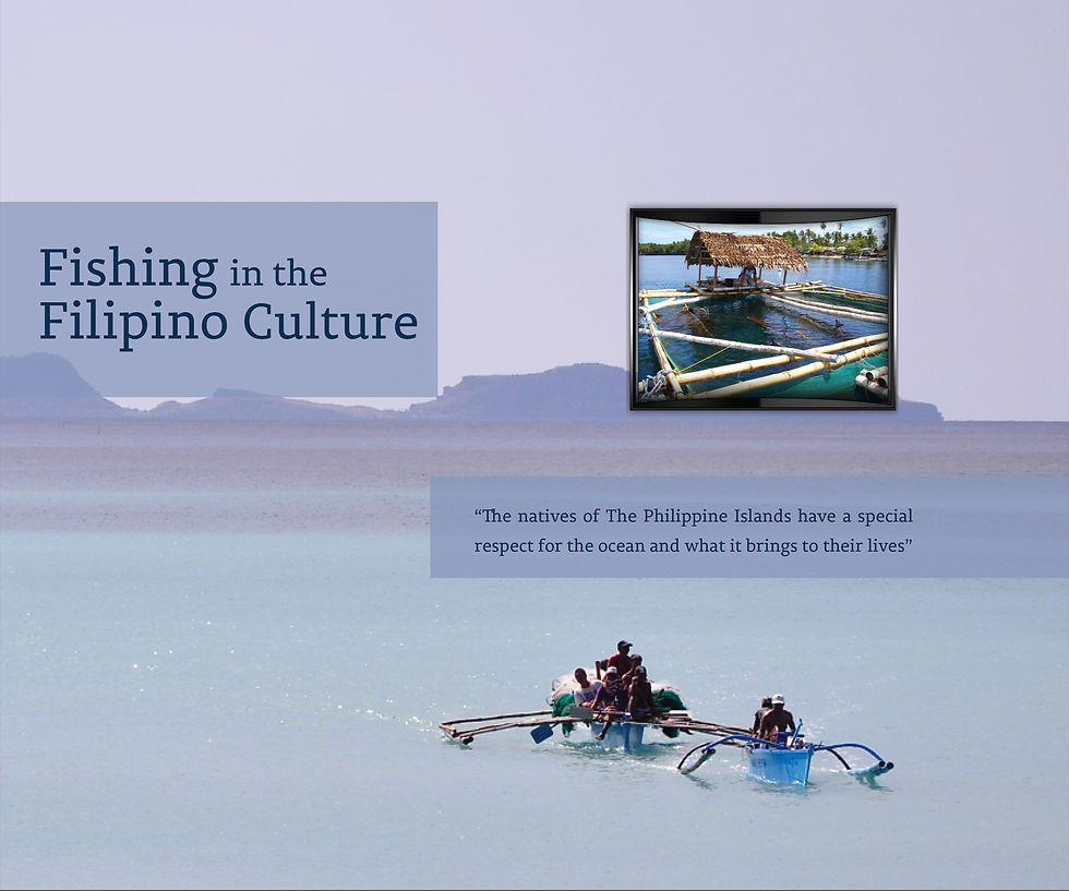
This project was inspired by the Filipino Culture and the people of the land of many pieces. The Filipino culture is all about how to respect one another, the land, and all the creatures in it.

The exhibit was inspired by the farming that happens in the tropical islands, showcasing both rice farming as well as fish farming. The wall has a stair-stepping effect that symbolizes the rice terraces of the native rice farmers.

